 this is my final project. I decided to send something to the Santa Fe community. It has paint splatter over it to represent all the colors and shapes coming together into one work of art. One word to describe this is fellowship. It represents how I feel about how people should come together and be 1 and not go against your own kind or peers.
0 Comments
hey I think this was the project I was in the office for the after the incident happened to me at school.
 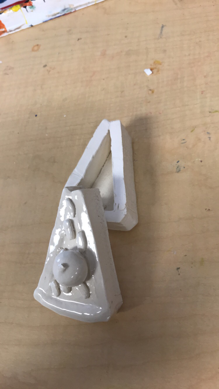 this is my clay trey set piece. It will be used for putting jewlery in and I came up with it because I loveeeeee food and so why not make food you can store things in. I used the cherry on top for a handle and glazed it at the end for a smooth finish.
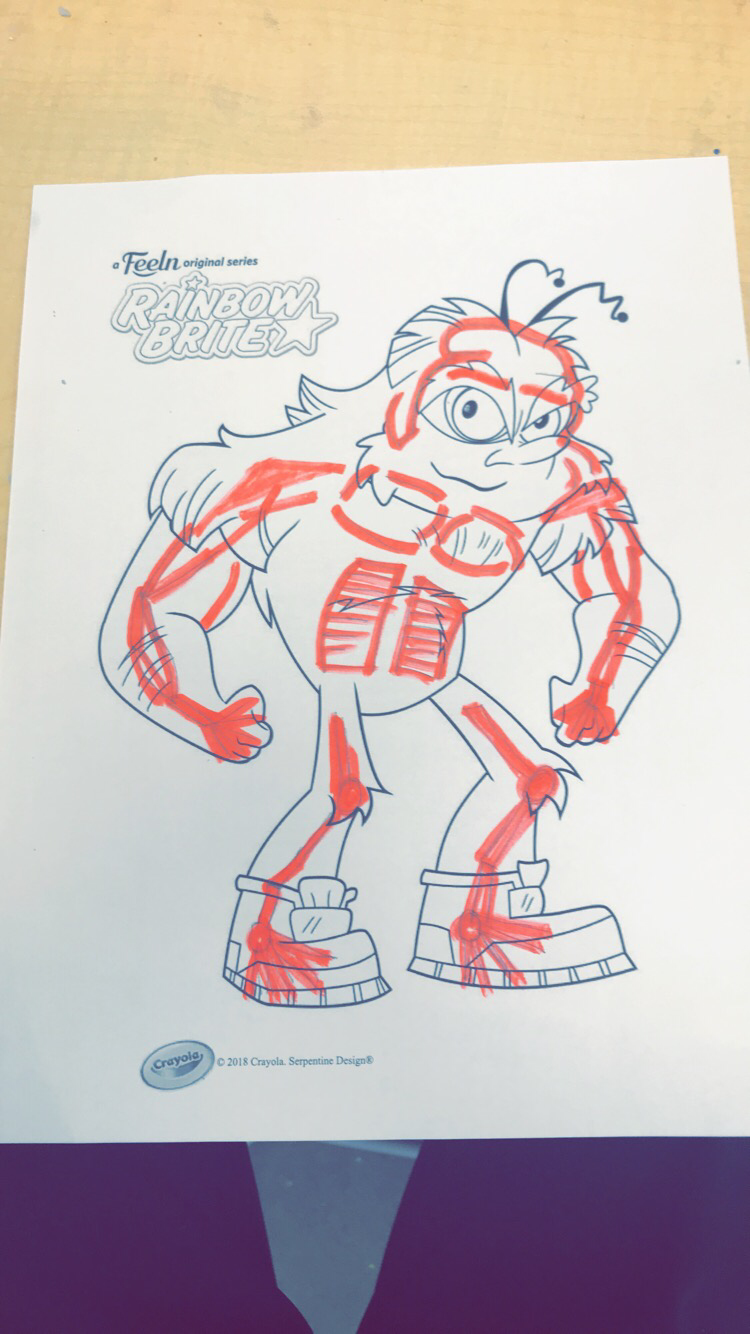 this is my skelaton warm up added to the other warm up photo
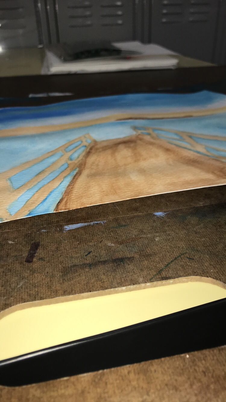 this is my water color perspective drawing of a little dock by the water of a lake. I used perspective 2. And the hardest part of his project was probably keeping my lines on the dock railing from touching each other and having the colors mix. 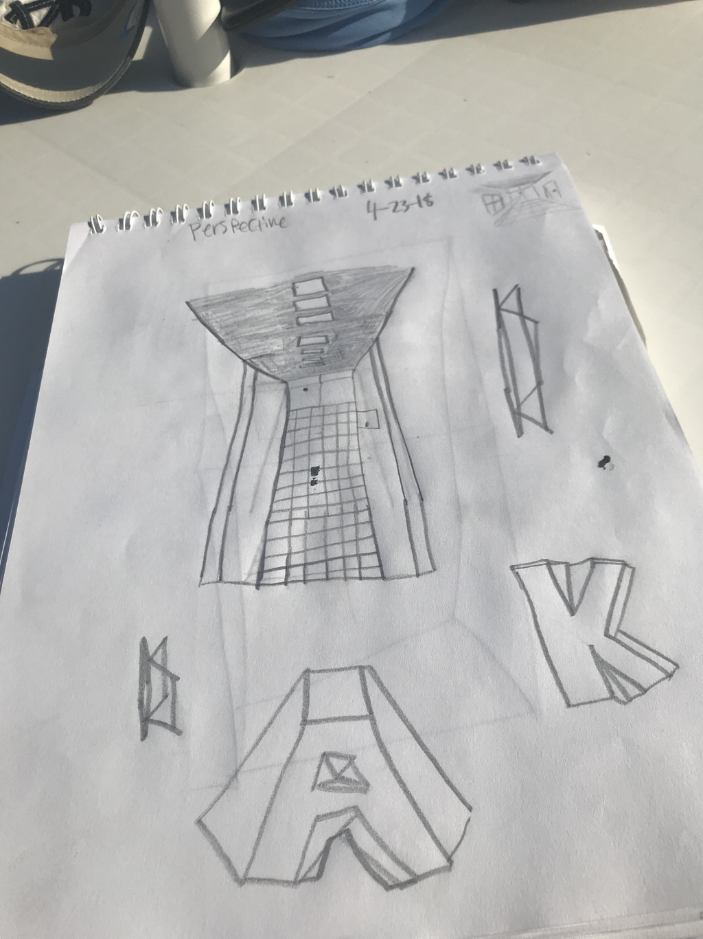 this was the most helpful perspective warmup. Mainly because doing the Hall way was a good way of deciding how far things should look or how close they should look. 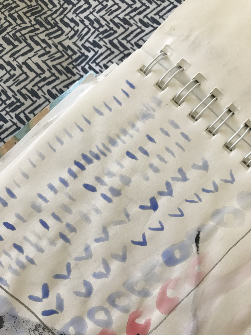 this was he most helpful watercolor warmup. It was mainly because it got me use to the brush strokes and the amount of use of paint that I needed.
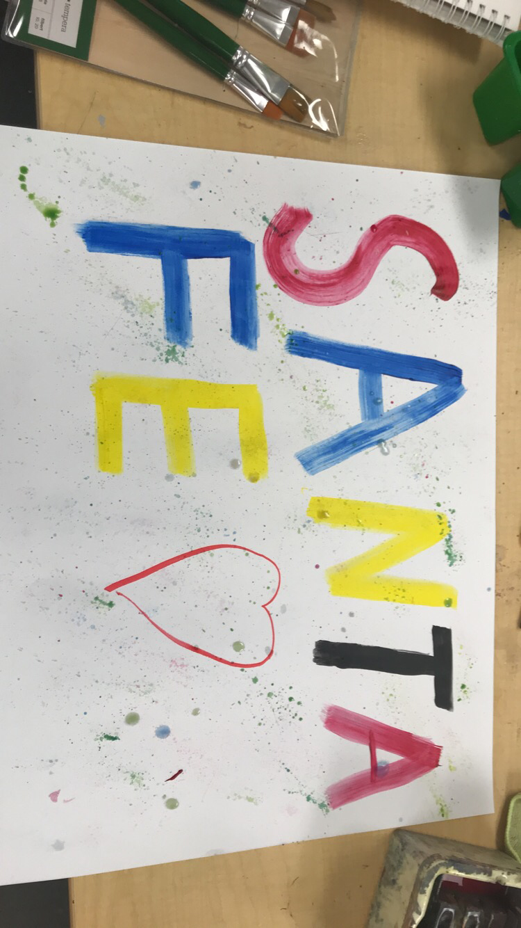 this is my final project. I wrote out Santa Fe and put a cool looking ink splatter on there kind of as a u ty of colors mixing together to come together just like how people should do. I want this to remind people we are all the same even tho we may be different colors.
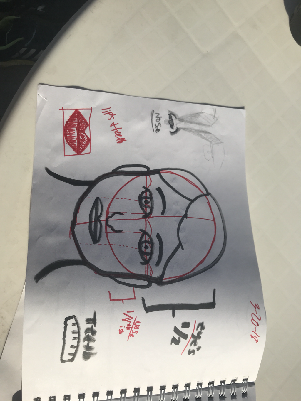  these are my warmup pieces part one. This shows the 3D shapes, the nose,mouth, teeth,ears,hair,eyes, and other facial features used for a face. The hardest one for me to do was the nose or the eyes probably just bc of the shading and shapes were hard for me. This picture also shows a detailed hallway picture in perspective.
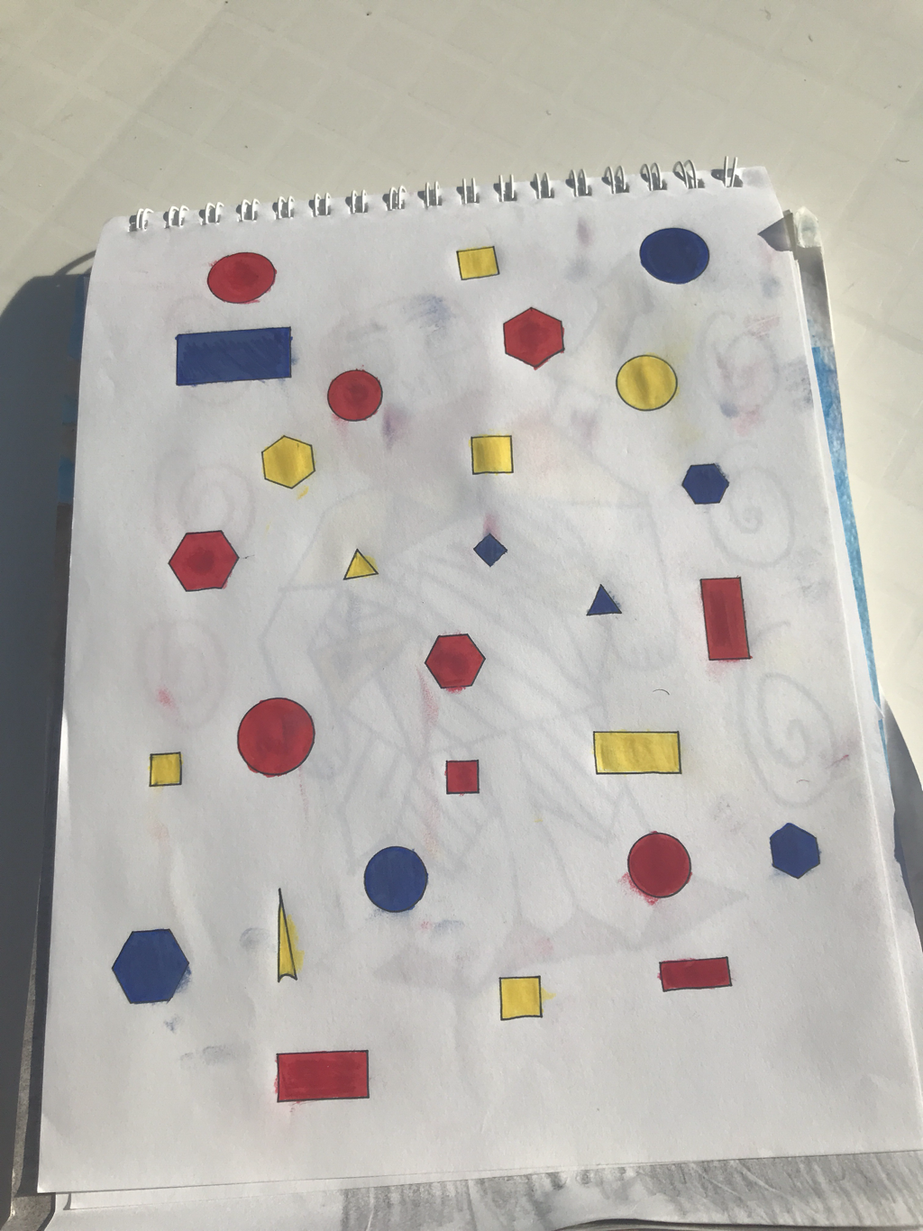 this is my multimedia project. I did shapers with only primary colors wich includes red, yellow, and blue. For my 5 mediums I used paint, marker, chalk, color pencil, and crayon to make up the 5 layers. And one word to portray my project would be retro. I feel like this could be a fool tshirt design.
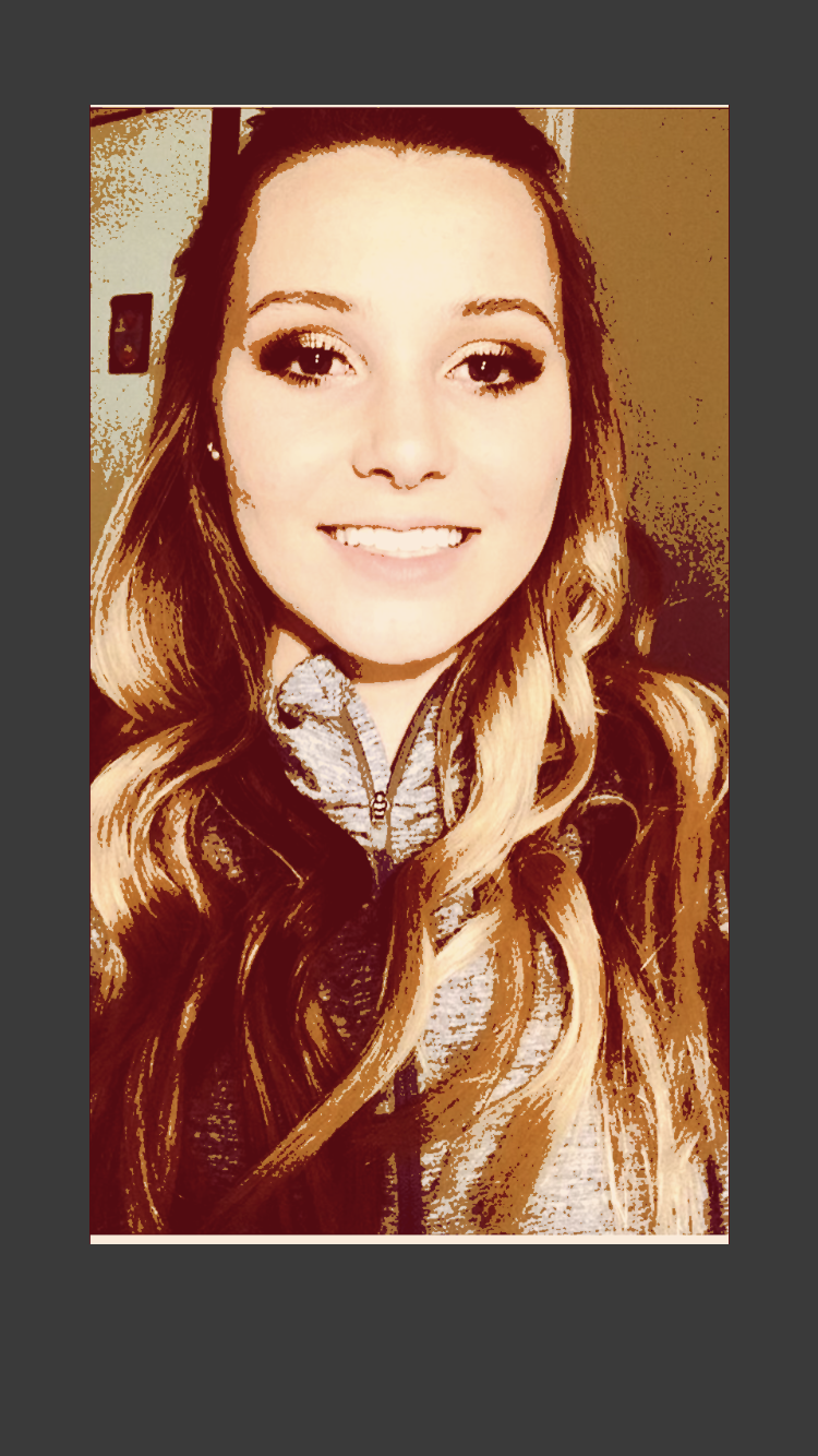 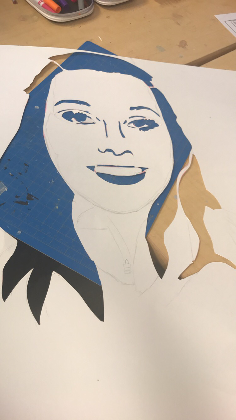 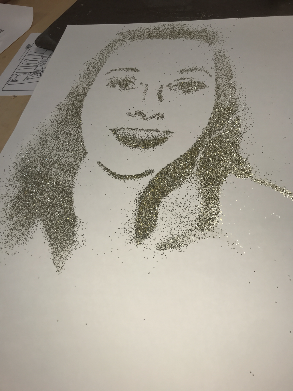 this is my portrait project. I did a portrait of my ex girlfriend Reva. I used a cut out of her I had traded over. And instead of painting or colouring I used sparkles so cut out the shadows of her in the picture and then fill them in with glue and sparkles to create the face I wanted. Next time I might not do a picture with so much hair. But I successfully think I got pretty close to what she actually looked like.
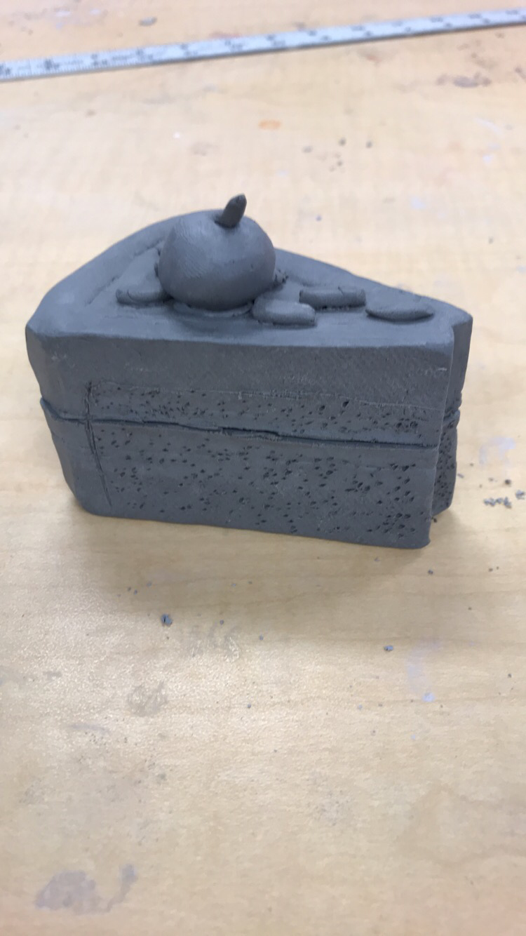
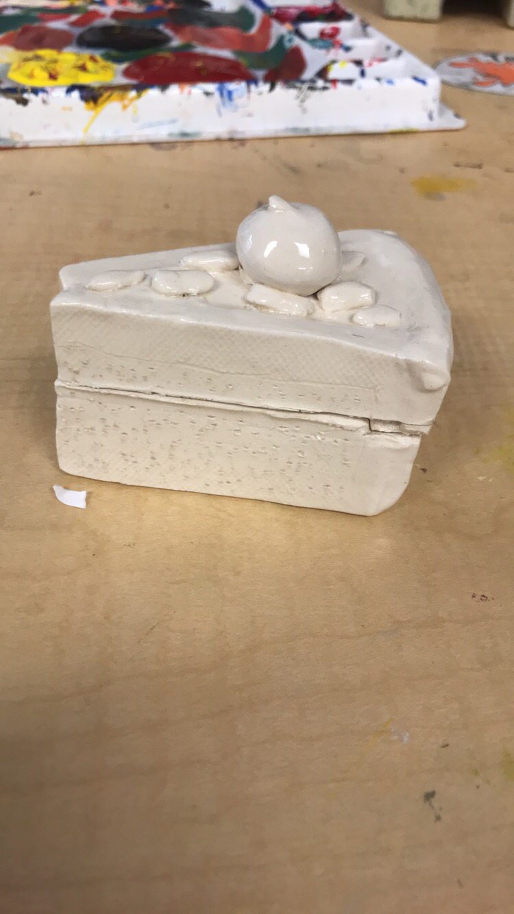 This is my final finished clay pottery piece. It is glazed all around it. I decided not to paint it with color. The hardest part for me was cutting the shapes out and measuring them to be equal and fit that was very frustrating. But what I like most about it is putting the texture on the side of the cake to make it look more realistic. My inspiration for this was that I love food. So of course I decided to do a cake. If I could change something I would have put smaller sprinkles on the cake. But I think I successfully did very well on the glazeware and it looked good after it was fired.  |
AuthorWrite something about yourself. No need to be fancy, just an overview. Archives
April 2018
Categories |
 RSS Feed
